LOCAVERSE Du klickst_alle kommen.
Mobile Dienstleistungen und Lieferservices – Österreichs größte Auswahl
While working at this startup, I had the chance to explore the UX field for first time in real life, developing myself and learning lots of amazing new skills.

Project duration:
June 2023 – December 2023 (remote)
Tools used:
Design, team & task arrangement: Figma, Procreate, GoogleMeet, Loom, ClickUp and Personio

My role and responsabilities
This is being my very first experience in the real UX/UI World and since I started, I jumped into a cross-functional role, being responsible for most of the UX and the UI tasks.
For each new design I do big RESEARCH, conduct COMPETITIVE AUDITS and analyze them, think out USER FLOWS, discuss them in team meetings, iterate them, WIREFRAME and MOCKUP them. Image search and composition and ICON DESIGN which I later vectorize is also a task I commonly do.
CONTEXT
Product
Locaverse.at is a new, mobile first platform, that uses the user’s current location to provide a list of mobile and delivery services available in Austria that CAN DIRECTLY REACH THEM, ensuring convenient and efficient delivery.
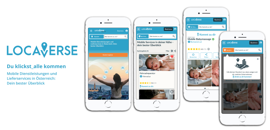
Their Unique Selling Proposition (USP) makes them stand out in front of other maketplace platforms:
Unique selling proposition (USP)

LOCAVERSE gives each service visibility,
defines an ACTION AREA for every single service,
asks the user for their current location
and automatically provides a list of mobile and delivery services available in Austria that CAN DIRECTLY REACH THEM!!
Here the link to the platform:
(please, keep in mind, that some things may have changed since I created this case study)
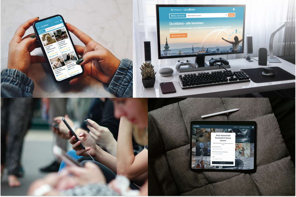
Challenge
Primary obstacle of this project lies in striking the right balance between emphasizing our unique selling proposition (USP) – highlighting the significance of user’s location for a fullfilling experience, given our specialization in location-based service searches – and delivering a satisfactory user experience through our platform.
Getting started

As a newcomer to this platform, my first step was to immerse myself in it. It was frustrating to try and navigate through the platform. Additionally, the lack of a clear USP made it difficult for me to understand what sets Locaverse apart from other similar platforms.
Without a strong USP, it’s challenging to see the value or benefit of choosing Locaverse over its competitors.
Furthermore, the lack of a logical flow within the platform made it confusing and time-consuming to move from one section to another. It was not intuitive to navigate through the various pages and understand how to access the different features or product listings.
Overall, my experience as a user trying to understand what Locaverse sells was frustrating and hindered by the basic and messy nature of the alpha 1.0 version.
I believed that without significant improvements in terms of layout, navigation, and providing a clear USP, it would be challenging for Locaverse to attract and retain users.
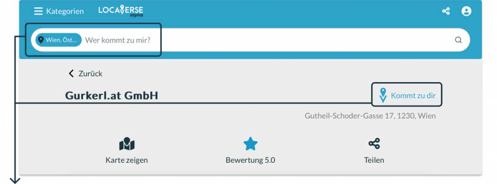

Unique selling proposition (USP) wasn’t clearly explained: I (as a user) didn’t know at all what the platform really offers


Too many CTA’s in different colors on each page, I (user) got confused
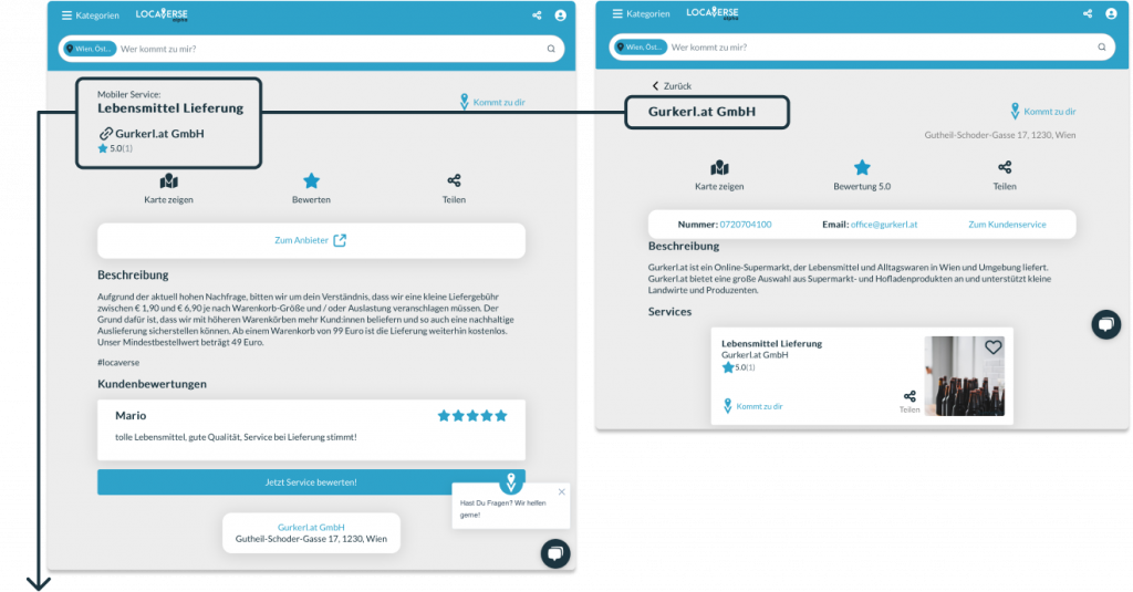

Doubled or very similar pages and links that got me (user) messed up. On the left, the service page and on the right the business page, which for the user’s eyes are way too similar to understand the need of both.

Lots of basic texts, without design, style nor arrangement.
After conducting my initial analysis, I reviewed all the previous work that had been done in UX , as well as in other departments, prior to my arrival.
I scheduled meetings with other UX designers working on the platform to understand the current state of the platform and their existing designs. I familiarized myself with their workflow and specially the Style Guide/Design System to understand and learn it.
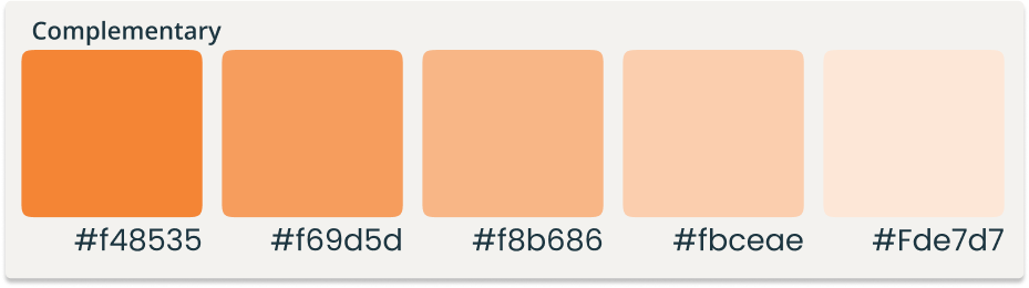
Colors

For primary there was a differentiation between the B2C part, and the one for businesses:



Logo

Typography


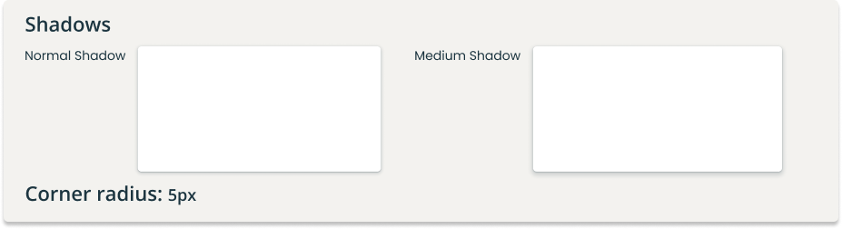
Elevation & corner radius
Devices & grid

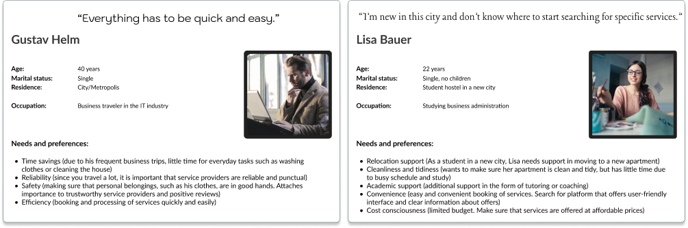
I interviewed the marketing team to understand their goals, target audience, and challenges. We updated the personas based on their insights.
I asked them about their pain points and challenges in reaching their target audience effectively.
Once the personas were finalized, I used them as a reference point throughout my design process. I made sure to keep the needs and goals of each persona in mind when designing the user experience. This allowed me to create a more targeted and relevant design that would resonate with the target audience.
THE PROBLEM
Once I understood, that our USER needs an easy to handle platform, quick and practical ways of getting to information and on the top of all a reliable product I could dive deeper into the different tasks I was given.
Problem
At LOCAVERSE I am forced to address urgent pain points on an already working online platform, that’s in constant evolution. We work by tasks, that are specific (pain) points on the plattform, that have to be improved or added from skratch.
For each new task I analyze indirect competitors like Amazon, Lieferando and Yelp, which have a similar layout and mission.
I then propose design and/or flow adjustments based on those insights, iterate them based on team feedback, where I allways collaborate with the CPTO of the company to assess back-end challenges and finally handle the final design to the development team.
Prototyping is typically unnecessary unless for new user flows or complex structures.
Therefore, instead of a comprehensive case study of the whole plattform, I will present a comparison of initial and final task states, along with the issues, enhancements and rationale behind the changes.

One of the first points on my task list was to identificate flows, that still were not working well. Such was the case of the location setting flow, a very important flow. We needed it to be really intuitive and easy, as knowing the location of the user is the basis for our USP.
But fact was, that it had some important pain points, that needed to be improved:
Before
Pain points & improvement possibilities:

There were serveral CTA’s at a time, what was very confusing.

I talked to the development department, on how to manage this point, as both possibilities: geolocalization & manual adress setting, were important to highlight.
We agreed, that it would be best (and technically possible) to divide the flow and set different CTA’s for both: mobile devices would have the GEOLOCALIZATION as CTA and on desktop, CTA would be for MANUAL ADRESS SETTING:



One dark blue CTA , when this color is supposed to be only for the business section.
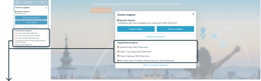
At this point, where the logged in user had saved a bunch of adresses, there was no way of using them directly as location. The user had to enter his dashboard and from there choose one of his saved adresses, what was really annoying.
The user also didn’t have the option of easily editing or removing those adresses.
As on the location setting flow itself we just needed the user to have quick access to saved adresses and be able to directly use them as locations on the plattform, I didn’t want to overload this section with delete and edit options.
Best choice was to include a link to the adress section in the dashboard.


The light background overlaying the whole page was annoying, as it denies the user any more options.
I decided to give the background a darker tone to enhance the visibility of the flow window. There was also the need of leaving the navigation bar functional, to stand out separately for easy access.
This approach not only highlights the main content but also ensures a seamless user experience.

vs. after
At this first point we decided to use a different CTA for each case: desktop and mobile. For users visiting the platform from their mobile devices, the CTA is now set for automatic geographical search (Aktuellen Standort suchen) when, on the other hand they are using a desktop, the CTA is for entering a new adress manually (Neue Adesse eingeben).
Also the background, independently on which page the user is when starting this flow, will be darkened, leaving the navigation and search bar out. This way, the user has several options to do and doesn’t feel forced to set a location.
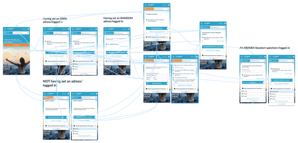
I divided the flow in 5 different starting points, on one side being LOGGED IN:
- Having set an own address
- Having set a RANDOM address
- Not having set any adress
Please, follow the link to see the prototype:
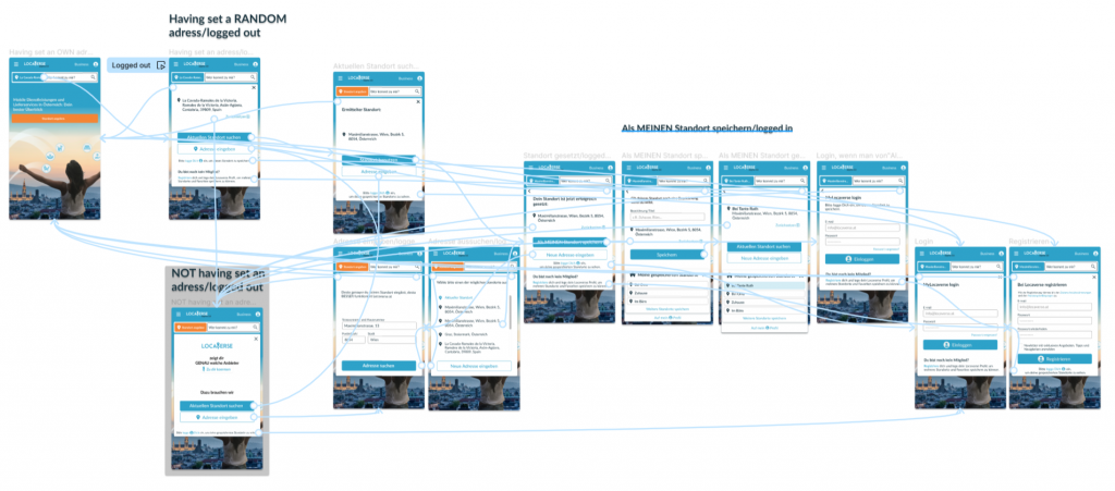
And on the other one being LOGGED OUT:
- NOT having set an address
- Having set a RANDOM address
Please, follow the link to see the prototype:

Task was, to propose a design for service and business pages, that were on a very basic level at that time.
Before
The current service page was really “alpha”, showing correctly all information about services, but without any design nor strategy behind, to guide the user to get clear about what he was looking at.
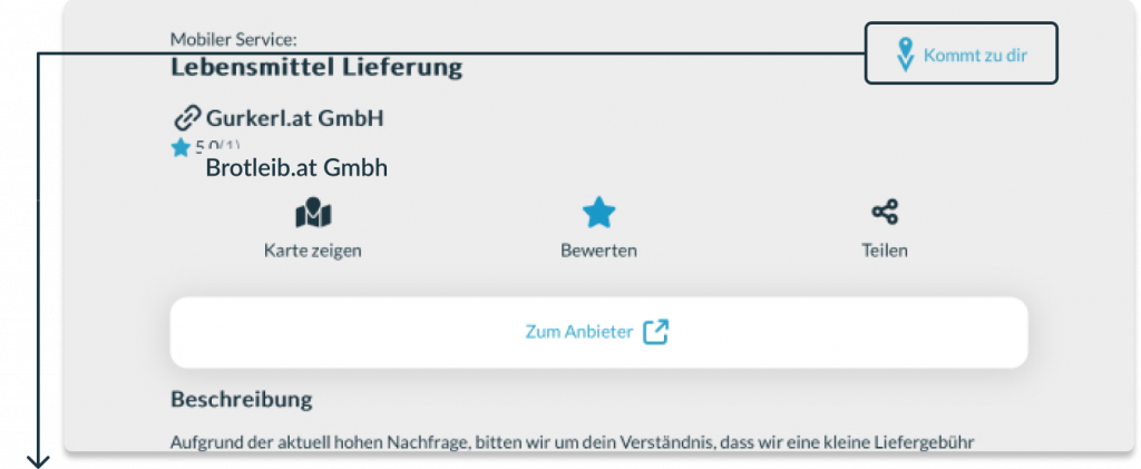
USP wasn’t supported at all, being placed on a hidden corner.
The companie’s Unique Selling Proposition is new in the market, indicating the user, exactly which “service” comes to them, so I decided to give it the most important place on top of all, with enough white space around to be identified easily:


The existing CTA was way too big, unproportioned and led the user to a business-information-page that was very similar to the prior service page.
User, and myself at te beginning also, got used and annoyed, not understanding on what page he was now: it was not clear at all, seeing similar, but differently arranged information about the same business.
Also this “alpha” layout <span style=»color: #E99355;»>didn’t give us the possibility to expand information</span>
to a PRO page or not even to add an image or a logo.
Our platform is built upon randomized data at the outset, with a heavy reliance on our B2B users and business owners who provide the services featured on our page. They play a vital role in introducing and expanding upon this data to market themselves effectively through our platform. To accommodate this, I wanted to develop a flexible design that can seamlessly highlight both simple and also more worked profiles , enabling businesses to truly stand out on our platform.
We decided to differentiate both sides better, showing all available information about the service (description, opening hours, images, social media, payment methods…) at first sight and leaving just specific business data for the business page.
After
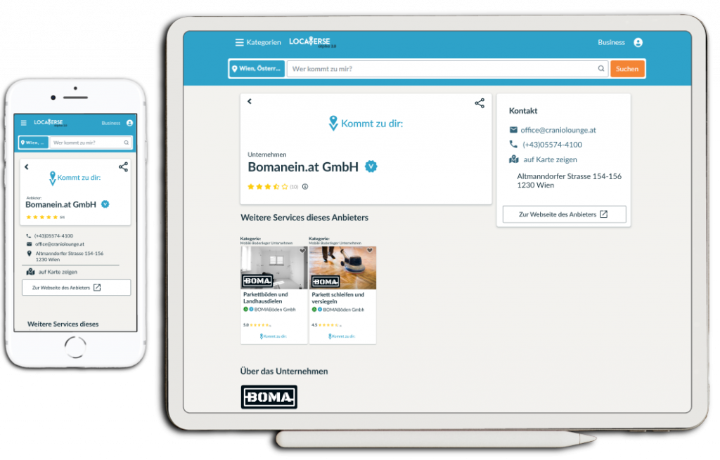
Service page
The new service page design shows USP on top and gives possibility to share and safe the service easily.Name, review, images and logo are shown in a main box, giving equal importance for horizontal or vertical images.
In another box there is placed the contact information, social media links, access to business data, paying methods….and both are expandable to add more or less information, depending on how much is available.


Business page
Just shows contact information and the services that offers this business.


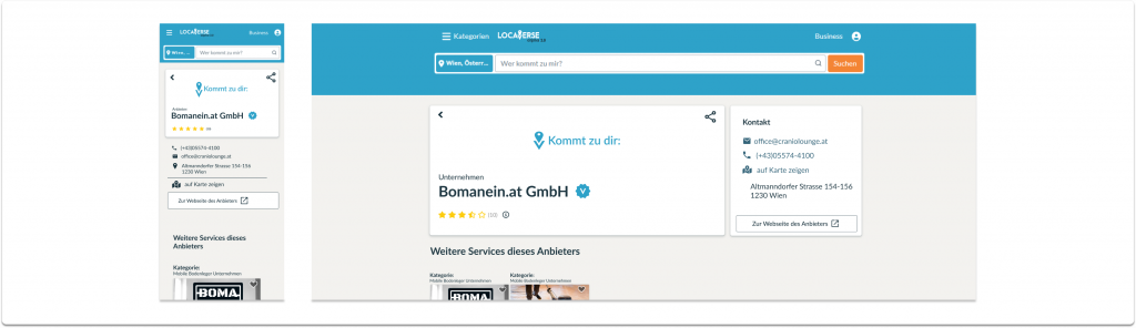
Task was to redesign the existent service cards. These cards are the cover letter for businesses to promote their mobile services.
Before

The Image placed on the right side seemed to be secondary, when we wanted to give them MORE IMPORTANCE.

The use of a horizontal and landscape layout caused the cards to be a displayed in a single column, stacked one under the other. This arrangement appeared particularly odd on desktop screens , as our intention was to enable users to view multiple cards simultaneously.
vs. after
To avoid all this, my proposal was to change the layout to a squared one.
Beneffiting from the new layout, I decided to give the image the most important place on top of all. Below, there are displayed service and business names and all the other main points are easily to identify.
All the info is divided in a “box system”, so the cards can easily be stretched or lengthened depending on the device the user is using.
It also allows 1-3 rows as max. for the service names without changing the card length, what is important, as most of the names are quite long.

This versality allows us to display multiple cards in at least 3 or 4 columns among the page, independently from their content.Your Attractive Heading


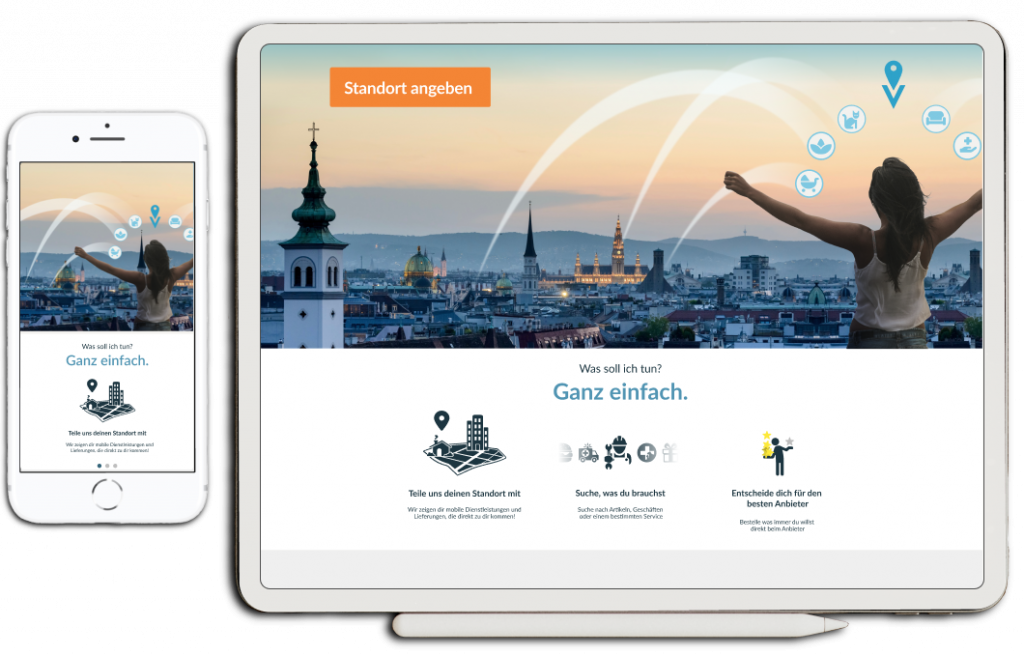
At this point there wasn’t anything designed to welcome the user and introduce them into WHAT Locaverse.at offers, but in fact we had the BIG NEED to highlight the USP to stand out from our big competitors, so after doing some research and taking as example Liferando.de, I proposed a 3-step-welcome-guide adapted to our needs.
This was my starting and inspiration point, from Liferando.de:

I designed different options for the icons I wanted to use (I decided to make them more complex than Liferando.de, because our platform is new and our users need much more detailed info to understand what our service is about) and with feedback from the team, we decided for the following three:


This welcome guide would be placed right under the hero image on the landing page, to give each new user a warm welcoming and helping them to know what to expect from our web.



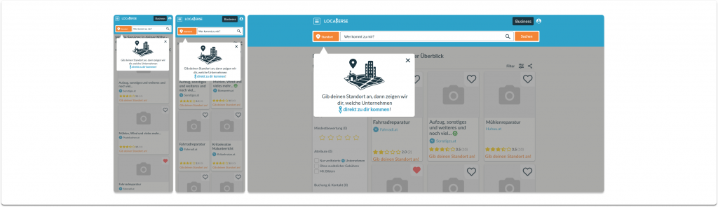
Task was to find a way of remembering the user in an effective but not super annoying way, that his location is essential for a satisfying user experience.
This overlay appears a few seconds after the user has opened a page, encouraging them to set a location.
For me it was essential to keep consistence with the welcome guide, so users could identify this message easily with our Unique Selling Proposition and get used to the need of setting a location, so I reused its location image.


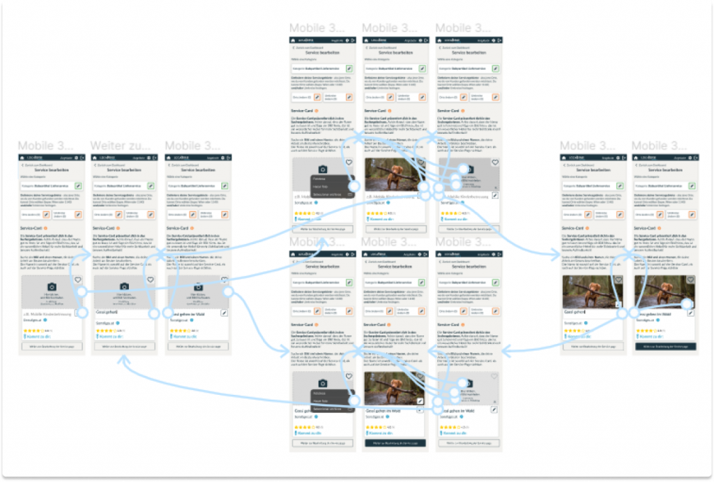
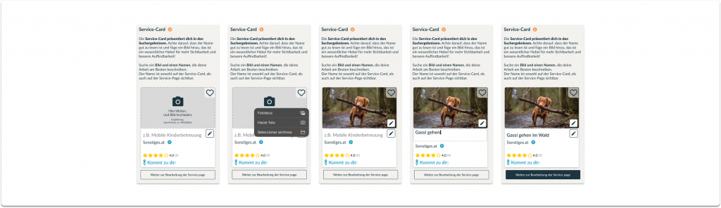
My task was to redesign the image upload for the service-cards. The form had already been improved before, but as the cards itself have changed from horizontal to vertical, it needed another iteration, as most of the users were not uploading any image for their cards.

Before
Pain points & improvement possibilities:

Symbolic image distracts from the urge of uploading an own image for this section.
Analyzing indirect but huge competitors like LinkedIn, Instagram etc. I decided to go for the most commonly used , intuitive and understandable placeholder and a short, concise text, inviting the user to upload an image by clicking the placeholder.
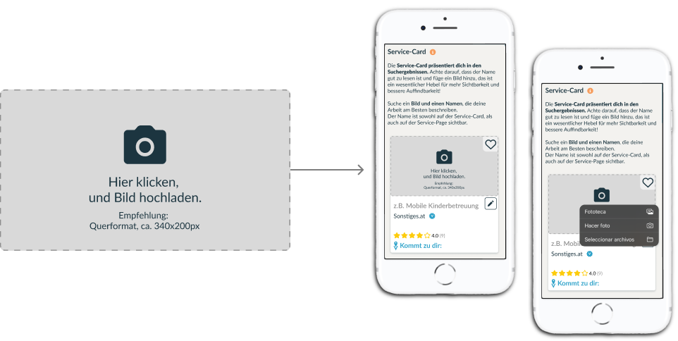

There is no explanation about what the service card was for and WHY it was so important to upload an appealing image for this section.
I added a much more extended text, explaining, WHERE this image and service name will appear in our web, and WHY it is so important. I also added a link to an info section, in case, a user wanted to learn even more about the theme.

For the user it’s confusing to know, WHERE the service name will appear on the cards. As each user is able to define their service name as they want, it is important, that they know the layout on which these will appear online, and adapt the name and length to make it visually appealing.
With this in mind, I decided to show the empty service-card, inviting to be edited on place, without jumping from one page to another.
Also, the CTA to continue turns from ghost button to dark blue as soon as all the inputs are filled in. This is how we gently guide the user, without forcing him to fill in any space.
vs. after
Please, follow the link to see the whole prototype work:
Locaverse.at – Service cards Prototype

The journey goes on!
We keep on working, learning from the user’s behaviour, adapting the design to new challenges and improving this platform on a daily basis.