Allekommen.at
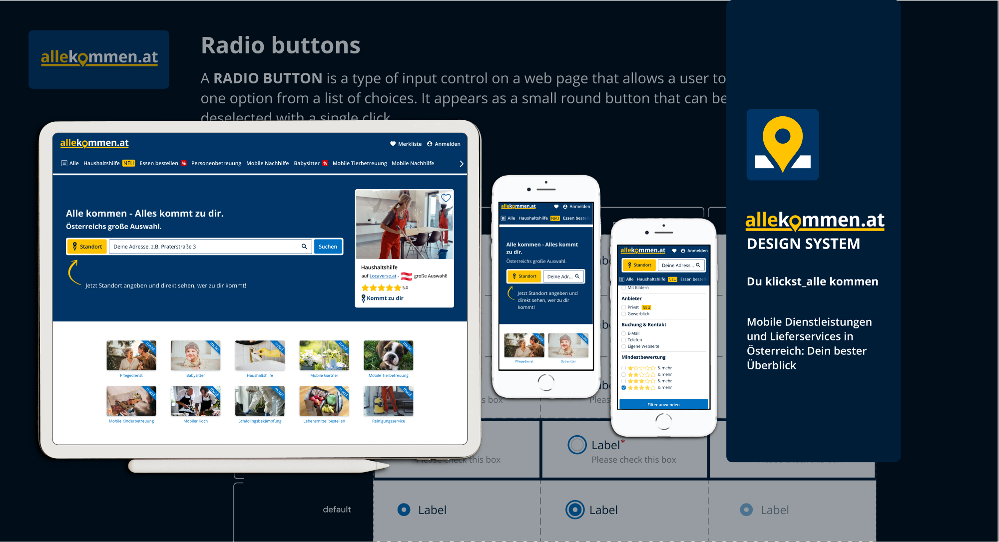
Once the alpha phase was completed, it was my responsibility to create a DESIGN SYSTEM for the company in order to maintain consistency throughout the entire platform.
Additionally, I was tasked with creating an ONBOARDING PROCESS to ensure that newcomers would have the necessary knowledge to use the Design System without requiring a personal introduction.
Project duration:
January 2024 – March 2024 (3 months)
Tools used:
Design, team & task arrangement: Figma, Procreate, GoogleMeet, Loom, Trello and Personio


CTO & Founder | Senior Software Engineer | Team Leader
December 7, 2023, Michael managed Carmen directly
Carmen has demonstrated exceptional professionalism, creativity, and reliability. Whether working independently or as part of a team, she consistently delivers outstanding results. Her ability to approach challenges with a fresh perspective and think outside the box has greatly enhanced the quality of our projects.
Her dedication to work is truly inspiring. Her contributions have played a significant role in our shared success, and we are incredibly grateful for her valuable participation. She put in a lot of thought in her UX work and implemented clean UI designs to create the best experience for our users. We also value her ability and motivation to analyze business needs when working on new concepts, which lead to very fruitful discussions.
We are excited to continue our collaboration with her on future projects and have complete confidence in her abilities. If you are seeking a motivated, talented, and dedicated professional, I can wholeheartedly recommend her without reservation.
CONTEXT
Product
After six months of continued work to enhance the smooth user experience (UX) functionalities of our platform, using the old Design System as a foundation, we assessed Locaverse.at using PageSpeed Insights. PageSpeed Insights is a tool created by Google to evaluate a website’s performance on both mobile and desktop devices.
Overall, our efforts to improve the platform’s UX had been successful, with positive outcomes in various areas and the results were positive in terms of BEST PRACTICES and SEO, but lacking in terms of ACCESSIBILITY:
Accessibility issues


Locaverse.at clearly had a weakness in ACCESSIBILITY, mainly due to the color palette.
Addressing this ACCESSIBILITY ISSUES highlighted by PageSpeed Insights needed to be a priority moving forward to ensure that all users could easily access and navigate our platform.
The actual color combination had to be improved urgently.
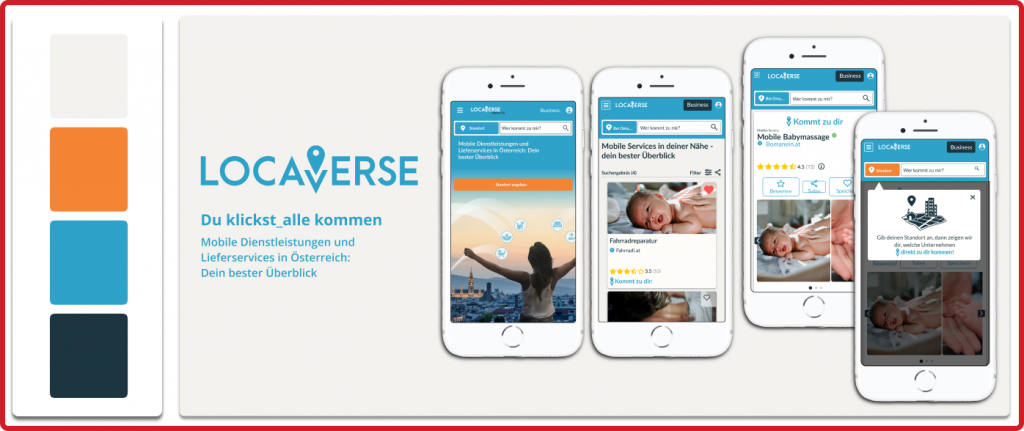
Each member of the UX/UI team was tasked with proposing a color scheme that meets accessibility codes, drawing inspiraion from Idealo.de and Amazon.com‘s use of dark blue combined with yellow or orange to convey confidence.
In my eyes, Locaverse’s (now allekommen.at) strength is being a MARKETPLACE FOR HUMAN RESOURCES, specifically for smaller services offered by self-employed individuals and small businesses that come to the user’s location. I believe that this focus sets Locaverse apart from other global and saturated marketplaces and should be emphasized to secure the future of the platform.
I investigated and went through different other marketplace platforms, that were using a blue and yellow/orange color palette, like Ikea, GoodYear, Visa, Amazon and Idealo:


All platforms that weren’t PURE “product” marketplaces gave most importance to their images (see Visa and Ikea), reducing all other colors around and just leaving them for some highlighting.
The strong blue used on headers and bigger surfaces resembles a working mono and conveys a cold and inert environment, which suits websites like Amazon, Idealo, or GoodYear that just sell products.
BUT I wanted to offer a warmer and more welcoming platform that highlights the human aspect from the start. Therefore I would give the USP a unique color to stand out over all, and would give the service images the full attention they deserved.
So, even though the dark blue palette was already installed in the marketing section’s brains, I decided to move forward with my proposal, taking the risk that it might be in vain.
I needed to convince the team about the urge of highlighting our human side in order to differentiate ourselves from our competitors.
There we go 🙂
I first checked colors for accessibility…

And than made a color proposition

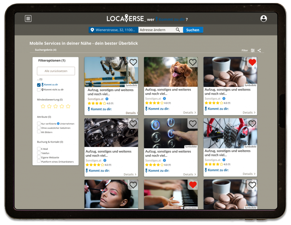
- Slightly warm GREY tones are used for backgrounds in order to cradle images and create an immersive experience. This also helps differentiate between menu levels on service and category pages, making it easier for users to navigate Locaverse (now allekommen.at).
- A strong electric BLUE, specially chosen for all issues having to do with the USP.
- An unsaturated ORANGE to catch the eye for CTA’s.
- A clear YELLOW used exclusively for the review stars.
- And finally a bright RED just for highlighting favorites, offers, etc…


With my proposal I wanted to convince the team about the urge of highlighting our human side in order to differentiate ourselves from our competitors, but my effort was in vain : ) and the new color palette was set in the following dark blue and yellow tones:

I can understand the decision, which is based on the fact that we are a marketplace and that dark blue communicates trust. However, I am still convinced that our exclusively human aspect sets us apart, and should be HIGHLIGHTED from first sight.
There was also a logo/name shift: same mission but simpler and more easily understandable name, that highlights our USP, great !


DESIGN SYSTEM & Style guide
After this name and color shift my new task was to create a complete new DESIGN SYSTEM. The current one was very simple and basic and wasn’t up to date at all…and terefore completely useless.
I started with a Style guide, to give the whole team (outside FIGMA) a guide on how to treat our brand identity:

Than I went over to the Design System.
First of all I decided to emphazise with the currently existing System, define its pain points and define, how to give them solution.
I also studied about how to structure a Design System with atomic methodology, so it would be VERY easy to use.

Pain points of the current System & solutions
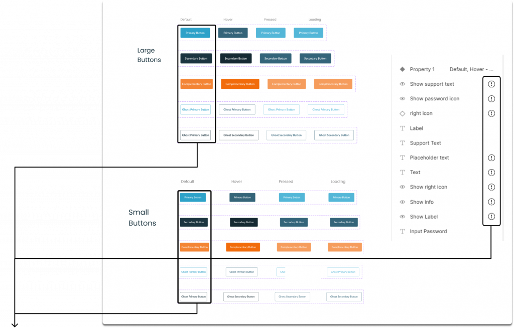

Buttons weren’t defined properly for mobile and desktop; their layout didn’t adapt to the text correctly.
There was NO OPTION of including icons inside the buttons.
Properties and variations weren’t defined at all, and therefore useless.
To solve this big issue, I started creating new buttons from scratch, taking into account our needs, colors, style…
I created 2 sizes (large & small)
4 types (default, ghost, icon only and icon on top) and
2 color versions (primary & secondary) to cover all our needs.

All variants could be reached through one single button component and its variants section

I was stuck for a while in a vicious circle of prototyping and creating components, only to test them on real designs and realize that they didn’t work properly for the type of team I was creating them for.

My clear mission was to make designing easier for newcomers, ensuring the use of correct, accessible, and visually appealing components so that the development department wouldn’t have to redesign the delivered designs during implementation to ensure the final product was user-friendly.
I first tried the most common way of treating placeholders, but…


Using different heights for icons to look good (here 20) and text (here the text has 24 for line height), it was impossible to align every single component well, and I would have needed LOTS of variants to fix this.
Below here just one example, showing the mismatch of some checkbox elements:

To address this issue, I adjusted the PLACEHOLDERS’ HEIGHT to match the line height of each text style. This allowed me to use one placeholder for all components, easily adapt icon sizes, align them with text sizes (even inside more complex component structures), and ensure visual appeal and user-friendliness across all cases.

Here one example of the before & after of the “icon/text size”-proportions in buttons. They are now proportioned and visually much more appealing.

Below here the same example from above, but now with a perfect alignment for ALL cases 🙂

I also checked if the same line height could effectively be applied to our buttons (and it did) and defined the padding for nearly (with some exceptions) ALL our icons on 3, within a 24-pixel icon box .
These proportions are designed to be responsive, adjusting in size based on the text line height.
This was great, because now new designers wouldn’t have to struggle to find the perfect icon size, as it was already fixed!

As said, define and actualize our icons was a big part of my work, too.


Till now, icons were still there from the very first beginning, and needed urgent actualization, as we were using complete different ones for the platform.
First of all I made a copilation of all actual icons we were using on the platform and gave them consistency in edges, stroke and style.

I also decided to treat some special components as icons, to ease their use, specially for newcomers.

To make these elements easily accessible for newcomers, which most often are inexperted UI/UX Junior Designers with NO EXPERIENCE in using a Design System or similar; I decided to define dimentions and positioning of the special icons previously existing on the plattform. One example is this “NEU” (”new”) badge: it is slightly higher than standard icons and much wider and was designed to be positioned only behind a menu label.
With the default placeholder, result was this stretched, deformed “NEU” badge:

To fix this from the start, I needed to introduce a specific placeholder, applied a unique instance swap property for that icon and selected it as a unique preferred value: now it was really easy to introduce this special icon in its right size and position.

Now it worked correctly.

I applied this method to the rest of inputs and actualized them according to what we needed.


Right now we had super simple and basic elements with NO defined thypography nor color… this made all these components useless when designing, as every new designer was performing those elements in a different way and that supposed a mess for the development department…
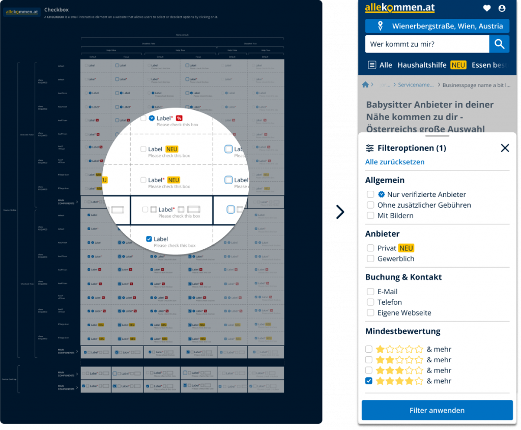
Due to this, I created new inputs like, checkboxes, text links, radio buttons, form fields and label text…often helping myself with already existing Design Systems like the NUXT UI System.

I took these as a base, adapted them in color, edges, text style to our needs and added different placeholders (when needed) to work directly inside these components.
This is the result of some of them:
Checkboxes
Text links

Form fields and label text

Menu

The whole System with Onboarding section and a component overview:


CONCLUSION
My personal conclusion is, that, obviously, a DESIGN SYSTEM is a living beeing, and therefore never “done”, so I keep on improving on a daily basis.
BUT, our ACCESSIBILITY ISSUES, highlighted by PageSpeed Insights are now on a VERY HIGH level, as you can see below.
This was part of the Design Systems’ mission, and it’s done so far : )

NEXT STEPS
During this adventure through my very first “self-created” DESIGN SYSTEM, I read, watched, studied and learned a bunch of super interesting new things about UX/UI.
One of the standout discoveries I made was Yu-Kai Chou’s «Actionable Gamification», which I found incredibly enlightening.
I have several suggestions for allekommen.at on how to enhance the presentation of each service on our platform, incorporate ads in a non-intrusive manner, and boost the sales of our click-out packages for services.
These proposals are centered around the concept of gamification and have the potential to elevate the platform and strengthen the company as a whole.
So let’s keep the great work : )

Boost illustration (for a business section inside allekommen.at) drawn by me.