Bats in our world
The 3rd. and last task or project for the -Professional Certificate of USER EXPERIENCE DESIGN (UX)- by Google through Coursera was to design a dedicated mobile app and a responsive website, focused on social good.
Wireframes, mockups and prototypes designed with FIGMA.
Project duration:
March 2023 – April 2023 (1 month)
Tools used:

CONTEXT
Product
Task was to design a dedicated mobile app and a responsive website, focused on social good:


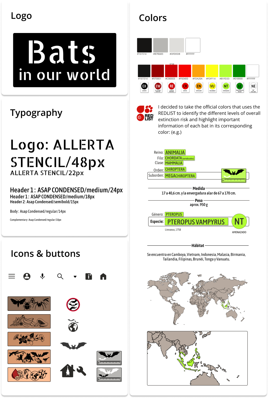
I wanted to create a web to visualize ALL the different types and species of bats living with us in the world and bring them closer to people with the aim of highlighting their urgent need of being protected, as, according to the UICN RED LIST most of the species are endangered.

Problem
To be able to create a tool with the purpose of arousing people’s need to protect bats, it was important to consider that these mammals are often perceived as dark and dangerous creatures due to the lack of information. The most critical factor for me was to ensure that the website was incredibly user-friendly and comprehensible. This would enable CHILDREN, TEENAGERS, and ELDERLY PEOPLE (who are often the ones narrating these negative stories about bats) to quickly access and comprehend the information provided.
Only then would I be able to highlight the incredible and fascinating nature of these animals.
Challenge
Bats in our world aims to become a milestone in educating the global community about the wonders of bats, fostering love and promoting their conservation.
The FINAL GOAL is to efficiently gather and organize comprehensive information about bats, including RESEARCH FINDINGS, THREATS TO THE SPECIES and WAYS TO CONTRIBUTE TO THEIR PROTECTION in various regions. Moreover, the platform will provide access to articles and connect users with bat-related associations worldwide.
This will enable every user to delve as deeply into bat species as they desire or require.
This was my last project inside the frame of the GoogleCertificate for UX, so also here I have worked on my own.
I had to slip into most of the roles, that are necessary to make a website prototype work:
RESEARCH | COMPETITIVE AUDITING & ANALYSIS | CRITICAL THINKING | IDEATION DESIGN | MODERATING USABILITY TESTS
As I was responsible for the hole process I followed all the creative steps:
GETTING STARTED

As a rookie in the bat world, first of all I had to EMPHAZISE with these tiny marvelous animals, research how the species are organized, how to group them but also paying attention to what differentiates them, which threats they suffer…
For learning about all this I interviewed Raúl Molleda, the responsible for MUR, a bat association in my area.

I also did big research in internet, in form of an exhaustive competitive audit, for learning about how most associations structure their webs for this same theme.
Of ALL of them I took the great parts : ) and tried to improve the ones I saw as PAIN POINTS:
Pain points& takeaways

Information is mostly offered with small and very cientific and complicated text and even for an adult teadious to read…


For Bats in our world I made the decision to compile the CRUCIAL information into a concise sentence, WITH THE OPTION to delve into a more comprehensive and scientifically-backed explanation for those seeking greater insights.

It´s really hard to find out how the bat species world is organized, as each page or association has its own way…

Most websites categorize bats based on their scientific names, which can be daunting for those without prior knowledge in the field.
My desire was to find an alternative approach, much more user-friendly and visually appealing.

Interesting information of a specific species is often hidden in general articles and is really hard to find.

Fascinating insights into the behaviors of various species are often buried within articles, only to be stumbled upon by chance.
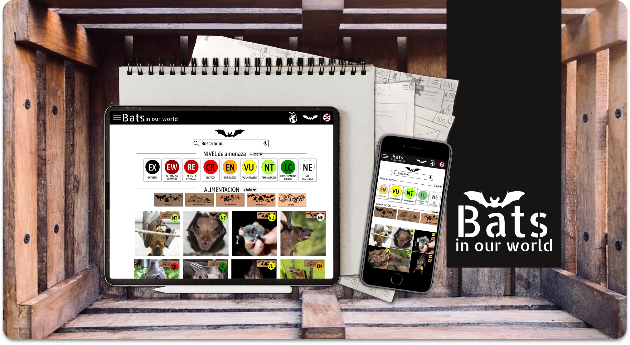
This realization prompted me to offer users multiple avenues for discovering information about bats on the platform. They can now employ direct search, engage in a visual ‘go through’ experience, search based on threat level or geographic area, or explore feeding behaviors.

Impossible to know that the information you are finding is veracious or not…

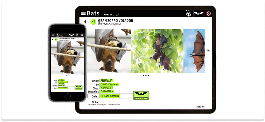
Although Wikipedia is known for its poor credibility, I really liked the clear way they have to structure information for each bat species. so I took this point as inspiration for Bats in our world.

I really love seeing closeby images of bats to effectively portray their typical mammal charme and this way gaining users empathy, which is the first step for their effective survival.
I was fascinated by this web: www.ratpenat.org
They have lots of super interesting information about all bats living in Catalonia (Spain), actualizing content constantly and giving the user deep insight to scientific and very concise data.
I took lots of ideas from them : )

Same as they do, I wanted to give the common name of the species importance, as it is the best way for users to remember them.
The IUCN code has to be clearly visible from first sight.

There should be references to articles, scientific data, other associations…etc..
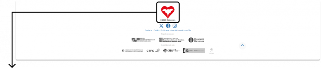
I even loved their logo: it reflected all the care they put in supporting bats in their area.
With my mind full of ideas, I needed to return to the ground and build empathy with my audience:
USER RESEARCH
Building empathy with the target users:
In the next step I completed a series of interviews with potential users ranging in age from 8 to 80. This allowed me to gain valuable insights into their needs and challenges when searching for specific information about bats in their local area.
Based on these interviews, I was able to develop the following personas to better understand our target audience.
Persona A
Problem statement
Gabi is a curious kid with elementary reading capabilities,
who needs to find a website that explains complicated data about bats in an easy and visual way,
because he wants to search for information without adult help.

Persona B
Problem statement
Noa is a mom that’s interested in the world that surrounds her and her family,
who needs to find an easy and officially supported app to consult while walking through the valley,
because she wants to explain her kids, which animals live around with them.

Persona C
Problem statement
Aurora is a nature loving grandmother,
who needs to find an easy way of getting information about bats in the valley she lives,
because she wants to explain her grandchildren old horror stories of bats, being able to contrast them with real information about these fabulous animals.


Goal
Gabi wants to find concrete information about bats that are living in his home area.


Improving possibilities taking in account the user journey
Give the web different depth levels:
- most common facts
- extended information and text
- investigation results
Give several species search options: demographic, threat levels, eating habits and distribution (for the start)
All option should be supported by visual icons and images
Obtain support from official entities and

Goal
In order to effectively organize the IA for this page, I dedicated substantial effort to thoroughly familiarize myself with the world of bats. I delved into understanding their unique characteristics, habits, curiosities, distribution, vulnerability, and more.
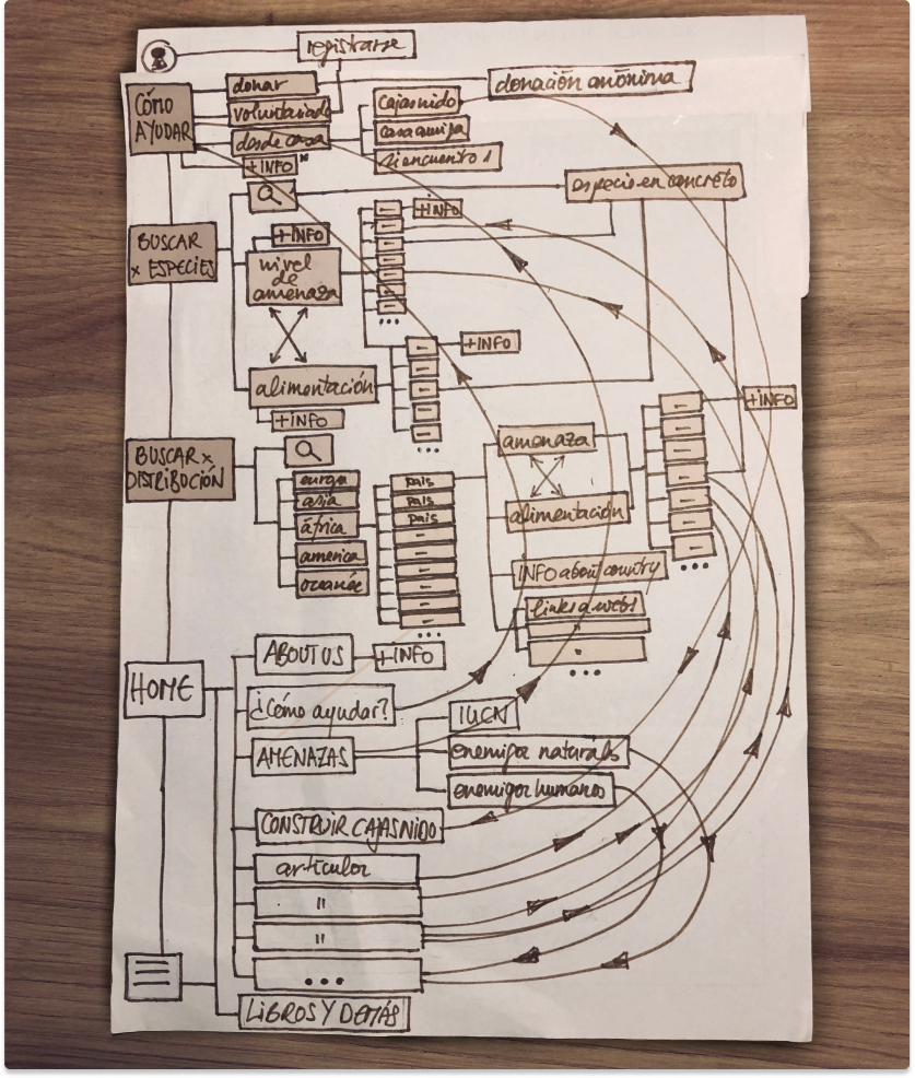
After extensive research, I made a decision to structure the site into three main sections:
search by DISTRIBUTION | search by SPECIES | GUIDELINES for supporting and aiding bats
This structure ensures easy navigation, enhances comprehension, and maintains reader interest.
It also gives the user the option of just viewing easy and fast the most common information, BUT being able to dive in much deeper into more extended information, or even getting into investigation results and studies done in different areas.

DESIGN DECISIONS
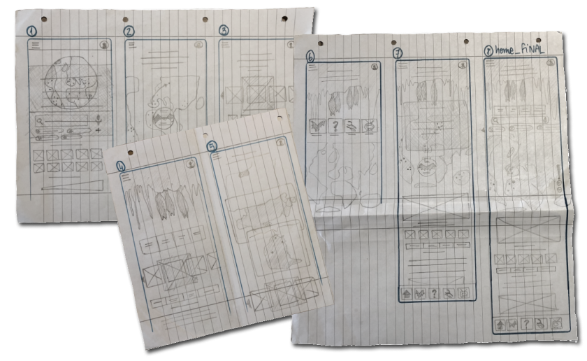
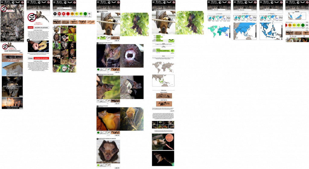
Next step was to work on wireframes, mockups, Lo- and Hifi prototypes for both, a dedicated mobile app and a responsive website.
Define a STYLE GUIDE
TEST on children primarily
I specifically wanted to conduct usability tests with children as my primary focus. I believe it is crucial to construct a web platform that caters to the needs of the next generation, hence my emphasis on Hi-fi prototypes. Conducting studies on Lo-fi prototypes proved challenging, as I relied heavily on visual functions to support the overall layout of the web and children didn’t understand wireframes.
This supposed more work for me, as the iterating process is more complex, but it was worth it.

VISUAL DESIGN
Paper and digital wireframes


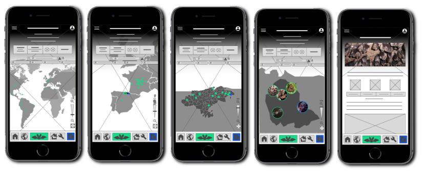
Mockups


Next was to design of the responsive website, following a mobile-first philosophy and gradually enhancing it for other screen sizes.
Paper and digital wireframes
After having conducted several tests and a usability study on this last high fidelity prototype and also on this new lo-fi, and messing myself with lots of changes and attempts of cleaning the screen, and giving most of IMPORTANCE to the images….
I decided to just learn from an image focused web that´s working almost perfect : )
and redo my designs.


Mockups


Labels for screen readers

Light and dark version


WHAT I LEARNED
CLEAN my style
This time, my main objective for this project was to achieve a CLEAN DESIGN. In my experience, I have developed a unique style for illustrating and designing fashion patterns which tends to be more intricate and elaborate. Therefore, it was crucial for me to make a shift towards a cleaner and more minimalistic approach for a better user experience.
As they say, «LESS IS MORE» but it is also important to find the right balance.
In this project, I believe I have found that equilibrium. However, I am well aware that there is always room for learning and improvement. I am excited to continue expanding my skills and refining my design techniques.
UNDERSTAND importance of always give another spin to all proposals.CLEAN my style
Last update: November 2023 (6 months after delivery)
After six months of an intense internship at Locaverse.at, a startup focused on designing a marketplace platform that shows users all human services and deliveries available in their location, I have decided to continue iterating and improving the existing design for this particular project:

Especially on mobile, the images illustrating feeding behavior were difficult to see. As a solution, I simplified the images and aligned their layout vertically on the card.

I decided to leave ]I[1 gap instead of cero between the cards for mobile (on desktop it is ]I[4 ) so the layout is clearer and more accessible.

Based on my real-life experience, I have found that handling images and gradients can pose challenges and hinder accessibility. To address this, I have taken the initiative to enhance the navigation bar, redirecting attention and placing greater significance on the essential tool provided by the platform: comprehensive and easily accessible information about bats worldwide.
Furthermore, in order to achieve a subtler and more balanced visual appearance, enhancing the integration of text with other design elements, as well as improving overall readability and accessibility, I made the decision to replace the primary color of pure black with a darker shade of grey, specifically, #16151


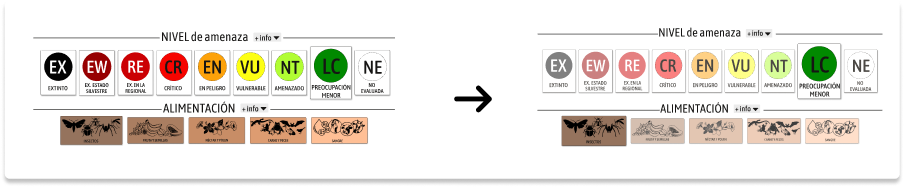
In order to provide users with the flexibility to make multiple and overlapping choices while filtering, I implemented a feature to highlight the selected options. To maintain the integrity and quality of the unselected options, I opted to minimize their color intensity to 50%. This ensures that even though they are not currently chosen, they can still be easily identified and selected if desired.


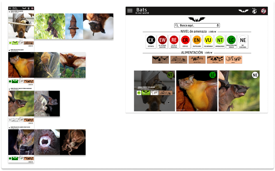
To enhance faster and more comprehensive card preview without accessing a specific species page, I have implemented two different solutions.
For mobile devices, the preview is scrollable, displaying basic information and providing the option to view more images by scrolling horizontally.
On desktop, the basic information is revealed when hovering over the cards, eliminating the need to expand the images further.
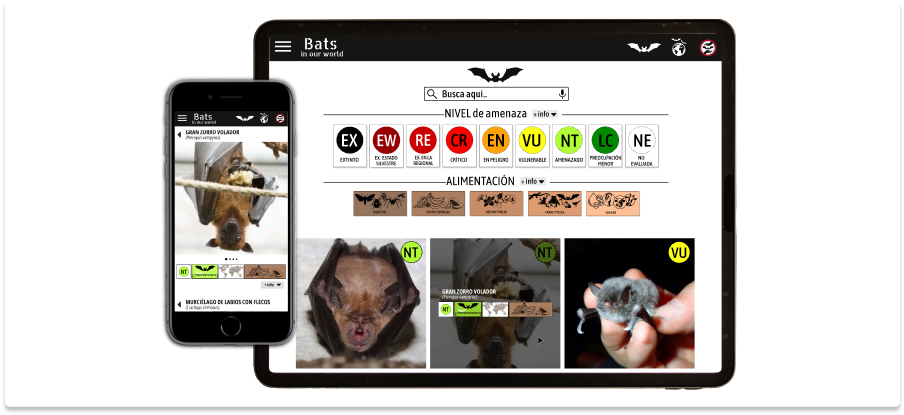
To improve readability and prioritize the official name and extinction risk level icon of the species, I have made the following enhancements: increasing the font size and simplifying the design of the «back-arrow.”